 Livewire PowerGrid
Features Setup
The setup() method controls the general resources present in your Table by separate action type within the table (Header, Footer, Exportable, ...)
You can find this method inside your PowerGrid file (e.g. DishTable.php).
Example of usage:
//..
use PowerComponents\LivewirePowerGrid\Header;
use PowerComponents\LivewirePowerGrid\Footer;

public function setUp(): array
{
    $this->showCheckBox();

     return [
         Header::make()
             ->showToggleColumns()
             ->showSearchInput(),

         Footer::make()
             ->showPerPage()
             ->showRecordCount(),
     ];
}
//..
use PowerComponents\LivewirePowerGrid\Header;
use PowerComponents\LivewirePowerGrid\Footer;
public function setUp(): array
{
$this->showCheckBox();
return [
Header::make()
->showToggleColumns()
->showSearchInput(),
Footer::make()
->showPerPage()
->showRecordCount(),
];
}You can chain the methods to configure the following features:
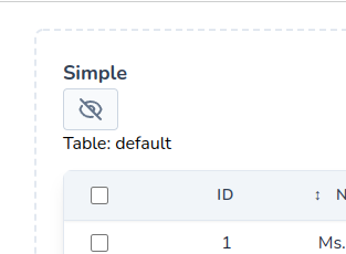
showCheckBox
Enables and displays checkboxes on each table row.
INFO
If your database table has a custom id column, you must pass the column name in the $attribute argument.
Example:
public function setUp(): array
{
    $this->showCheckBox();
    //$this->showCheckBox('my_custom_table_id);

}
public function setUp(): array
{
$this->showCheckBox();
//$this->showCheckBox('my_custom_table_id);
}Result: 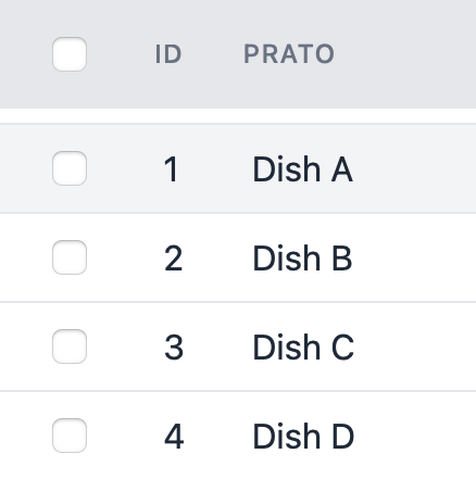
Header
Here are some actions for the table header defined inside setup:
- showSearchInput
- showToggleColumns
- includeViewOnTop
- includeViewOnBottom
Header
showSearchInput
Enables the search functionality and show the search input field at the page top.
use PowerComponents\LivewirePowerGrid\Header

public function setUp(): array
{
    $this->showCheckBox();

     return [
         Header::make()
             ->showSearchInput(),

         // ...
     ];
}
use PowerComponents\LivewirePowerGrid\Header
public function setUp(): array
{
$this->showCheckBox();
return [
Header::make()
->showSearchInput(),
// ...
];
}Result: 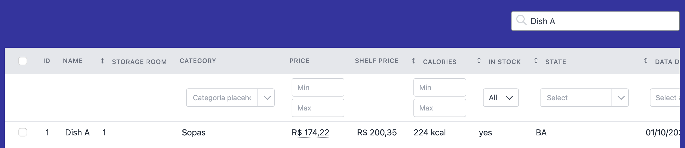
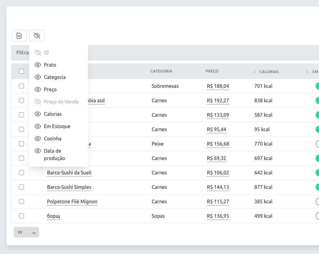
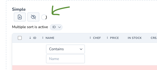
showToggleColumns
Displays the button to hide/show (toggle) columns.
Works fine without inline filters Example:
use PowerComponents\LivewirePowerGrid\Header

public function setUp(): array
{
    $this->showCheckBox();

     return [
         Header::make()
             ->showToggleColumns(),

         // ...
     ];
}
use PowerComponents\LivewirePowerGrid\Header
public function setUp(): array
{
$this->showCheckBox();
return [
Header::make()
->showToggleColumns(),
// ...
];
}Result:
includeViewOnTop
Sometimes we need to reuse the current scope of the table using @include instead of using events.
use PowerComponents\LivewirePowerGrid\Header

public function setUp(): array
{
    $this->showCheckBox();

     return [
         Header::make()
             ->includeViewOnTop('components.datatable.header-top'),

         // ...
     ];
}
use PowerComponents\LivewirePowerGrid\Header
public function setUp(): array
{
$this->showCheckBox();
return [
Header::make()
->includeViewOnTop('components.datatable.header-top'),
// ...
];
}Inside the view you can use the component's variables
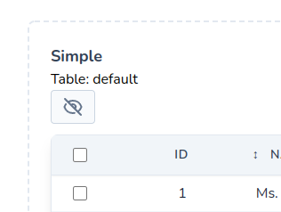
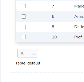
view/components/datatable/header-top.blade.php
<div>
    Table: {{ $tableName}}
</div><div>
Table: {{ $tableName}}
</div>Result:
includeViewOnBottom
Sometimes we need to reuse the current scope of the table using @include instead of using events.
use PowerComponents\LivewirePowerGrid\Header
public function setUp(): array
{
$this->showCheckBox();
return [
Header::make()
->includeViewOnBottom('components.datatable.header-bottom'),
// ...
];
}use PowerComponents\LivewirePowerGrid\Header
public function setUp(): array
{
$this->showCheckBox();
return [
Header::make()
->includeViewOnBottom('components.datatable.header-bottom'),
// ...
];
}Inside the view you can use the component's variables
view/components/datatable/header-bottom.blade.php
<div>
    Table: {{ $tableName}}
</div><div>
Table: {{ $tableName}}
</div>Result:
withoutLoading
If you don't want to display PowerGrid's default loading icon when some request is made to the server, just call withoutLoading() on Header Facade.
This is useful when you already have a layout to show the progress of internal calls, for example Defer Loading.
use PowerComponents\LivewirePowerGrid\Header
public function setUp(): array
{
return [
Header::make()
->withoutLoading(),
// ...
];
}use PowerComponents\LivewirePowerGrid\Header
public function setUp(): array
{
return [
Header::make()
->withoutLoading(),
// ...
];
}Result:
Footer
Here are some actions for the table footer defined inside setup:
showPerPage, showRecordCount, pagination, includeViewOnTop and includeViewOnBottom
showPerPage
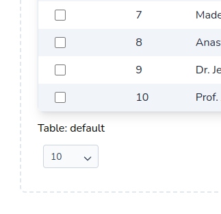
Shows a dropdown menu for selecting the number of rows displayed per page (default: 10).
By default, $perPage accepts the values: 10, 25, 50, 100 and 0 (zero represents "show all").
If you need a different set of values, you may override the $perPageValues array. See the following example:
use PowerComponents\LivewirePowerGrid\Footer
class DishesTable extends PowerGridComponent
{
//Custom per page
public int $perPage = 5;
//Custom per page values
public array $perPageValues = [0, 5, 10, 20, 50];
public function setUp(): array
{
return [
Footer::make()
->showPerPage($this->perPage, $this->perPageValues)
//....
]
}
}use PowerComponents\LivewirePowerGrid\Footer
class DishesTable extends PowerGridComponent
{
//Custom per page
public int $perPage = 5;
//Custom per page values
public array $perPageValues = [0, 5, 10, 20, 50];
public function setUp(): array
{
return [
Footer::make()
->showPerPage($this->perPage, $this->perPageValues)
//....
]
}
}Result:

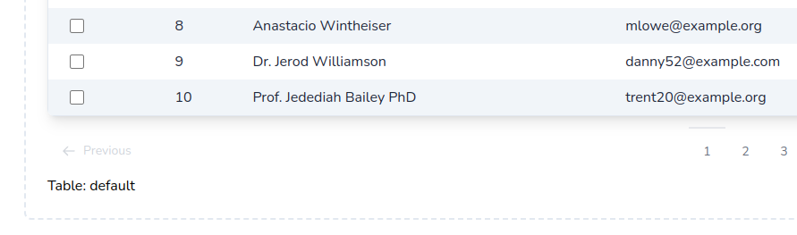
showRecordCount
Shows the record count at the page bottom.
Available modes:
- full (default): Full sentence. E.g.,
Showing 1 to 10 of 100 Results. - short: Only numbers including total. E.g,
1 - 10 | 100. - min: Only numbers, without total. E.g.,
1 - 10
Example:
use PowerComponents\LivewirePowerGrid\Footer
class DishesTable extends PowerGridComponent
{
public function setUp(): array
{
return [
Footer::make()
->showRecordCount(mode: 'full')
//....
]
}
}use PowerComponents\LivewirePowerGrid\Footer
class DishesTable extends PowerGridComponent
{
public function setUp(): array
{
return [
Footer::make()
->showRecordCount(mode: 'full')
//....
]
}
}Result:

Pagination
Sometimes we need to customize the pagination of the table, for that do:
use PowerComponents\LivewirePowerGrid\Footer
class DishesTable extends PowerGridComponent
{
public function setUp(): array
{
return [
Footer::make()
->showPerPage(25)
->showRecordCount()
->pagination('components.pagination'),
//....
]
}
}use PowerComponents\LivewirePowerGrid\Footer
class DishesTable extends PowerGridComponent
{
public function setUp(): array
{
return [
Footer::make()
->showPerPage(25)
->showRecordCount()
->pagination('components.pagination'),
//....
]
}
}TIP
Inside the view you can use the paginator variables, perPage and perPageValues to build the footer
NOTE: need use methods ->showPerPage(25)->showRecordCount()
views/components/pagination.blade.php
<div class="w-full">
@if ($paginator->hasPages())
// ..
@endif
</div><div class="w-full">
@if ($paginator->hasPages())
// ..
@endif
</div>Result:
Custom PageName in URL
Sometimes you might need to change the default pageName (?page=) in the URL. This is useful when working with two Livewire components on the same page, avoiding collisions between the two paginators.
The example below shows how to use a different pageName for each component.
The component "Customer Page", configured to use ?customerPage=:
<?php
// /app/Livewire/CustomersTable.php
Footer::make()
->pageName('customerPage')<?php
// /app/Livewire/CustomersTable.php
Footer::make()
->pageName('customerPage')The component "User Page", configured to use ?usersPage=:
<?php
// /app/Livewire/UsersTable.php
Footer::make()
->pageName('usersPage')<?php
// /app/Livewire/UsersTable.php
Footer::make()
->pageName('usersPage')The blade view will look similar to this:
<div>
<livewire:customers-table />
<livewire:users-table />
</div><div>
<livewire:customers-table />
<livewire:users-table />
</div>And the browser url will have both page names: http://myapp.local/?customerPage=2&usersPage=5
Query String
Sometimes you might need to exclude data from your components query string.
You can read more about excluding query string values in the Livewire documentation.
The example below will generate a url similar to http://myapp.local/?name=Ark&category=1&price_start=8&price_end=10&diet=1?page=2
<?php
// /app/Livewire/MyTable.php
protected function queryString(): array
{
return [
'search' => ['except' => ''],
'page' => ['except' => 1],
...$this->powerGridQueryString(),
];
}<?php
// /app/Livewire/MyTable.php
protected function queryString(): array
{
return [
'search' => ['except' => ''],
'page' => ['except' => 1],
...$this->powerGridQueryString(),
];
}includeViewOnTop
Sometimes we need to reuse the current scope of the table using @include instead of using events.
use PowerComponents\LivewirePowerGrid\Footer
class DishesTable extends PowerGridComponent
{
public function setUp(): array
{
return [
Footer::make()
->includeViewOnTop('components.datatable.footer-top')
//....
]
}
}use PowerComponents\LivewirePowerGrid\Footer
class DishesTable extends PowerGridComponent
{
public function setUp(): array
{
return [
Footer::make()
->includeViewOnTop('components.datatable.footer-top')
//....
]
}
}TIP
Inside the view you can use the component's variables
views/components/datatable/footer-top.blade.php
<div>
    Table: {{ $tableName}}
</div><div>
Table: {{ $tableName}}
</div>Result:
includeViewOnBottom
Sometimes we need to reuse the current scope of the table using @include instead of using events.
use PowerComponents\LivewirePowerGrid\Footer
class DishesTable extends PowerGridComponent
{
public function setUp(): array
{
return [
Footer::make()
->includeViewOnBottom('components.datatable.footer-bottom')
//....
]
}
}use PowerComponents\LivewirePowerGrid\Footer
class DishesTable extends PowerGridComponent
{
public function setUp(): array
{
return [
Footer::make()
->includeViewOnBottom('components.datatable.footer-bottom')
//....
]
}
}TIP
Inside the view you can use the component's variables
views/components/datatable/footer-bottom.blade.php
<div>
    Table: {{ $tableName}}
</div><div>
Table: {{ $tableName}}
</div>Result:
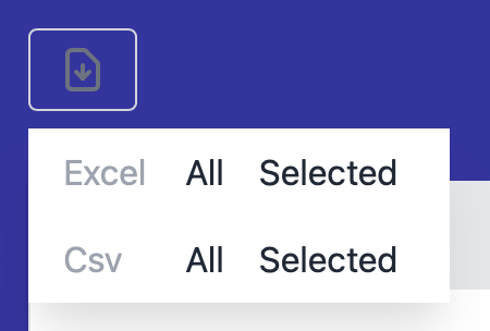
Exportable
Enable the export to file functionality and shows export button at the page top.
Set the filename inside the make('') method and proceed configuring your exporting settings:
Import WithExport Trait
use PowerComponents\LivewirePowerGrid\Traits\WithExport;

final class ExportTable extends PowerGridComponent
{
    use WithExport;
    //...
use PowerComponents\LivewirePowerGrid\Traits\WithExport;
final class ExportTable extends PowerGridComponent
{
use WithExport;
//...Usage
use PowerComponents\LivewirePowerGrid\Exportable

class DishesTable extends PowerGridComponent
{
    public function setUp(): array
    {
        Exportable::make('my-export-file')
            ->striped('#A6ACCD')
            ->type(Exportable::TYPE_XLS, Exportable::TYPE_CSV),
    }
}
use PowerComponents\LivewirePowerGrid\Exportable
class DishesTable extends PowerGridComponent
{
public function setUp(): array
{
Exportable::make('my-export-file')
->striped('#A6ACCD')
->type(Exportable::TYPE_XLS, Exportable::TYPE_CSV),
}
}File Types
Available file types:
- excel - Exportable::TYPE_XLS
- csv - Exportable::TYPE_CSV
Example:
->type(Exportable::TYPE_XLS, Exportable::TYPE_CSV),->type(Exportable::TYPE_XLS, Exportable::TYPE_CSV),Result:
CSV Separator and Delimiter
When exporting to CSV, you may configure the field separator and field delimiter:
    Exportable::make('my-export-file')
        ->csvSeparator('|')
        ->csvDelimiter("'")
->type(Exportable::TYPE_XLS, Exportable::TYPE_CSV), Exportable::make('my-export-file')
->csvSeparator('|')
->csvDelimiter("'")
->type(Exportable::TYPE_XLS, Exportable::TYPE_CSV),Resulting in :
ID|Dish
1|'Pastel de Nata'
2|'Peixada da chef Nábia'
3|'Carne Louca'
ID|Dish
1|'Pastel de Nata'
2|'Peixada da chef Nábia'
3|'Carne Louca'Striped
You can also pass the striped parameter with the name of the color to be generated with striped lines.
Example:
->stripe('A6ACCD'),->stripe('A6ACCD'),Column width
Specify column and size if you need to increase column width on export.
XLSX only
Example:
->columnWidth([
    2 => 30,
    4 => 20,
]),->columnWidth([
2 => 30,
4 => 20,
]),TIP
💡 If you are working with lots of data, we recommend to use Queue Export.
Persist
If you need the state of columns and filters to be saved in cookies, you can use the persist method.
Example:
class DishesTable extends PowerGridComponent
{
    public function setUp(): array
    {
        $this->persist(['columns', 'filters']);

        return [
            // ..
        ];
    }
}
class DishesTable extends PowerGridComponent
{
public function setUp(): array
{
$this->persist(['columns', 'filters']);
return [
// ..
];
}
}Result:
Multi Sorting
PowerGrid v4 allows you to choose multiple columns to sort by.
To enable multi sorting, you must set the property $multiSort to true in your PowerGrid table class.
Additionally, even if disabled, multi sorting can be achieved by holding shift and clicking on different columns.
use PowerComponents\LivewirePowerGrid\Traits\WithExport;

final class YourPowerGridTable extends PowerGridComponent
{
     public bool $multiSort = true;
}
use PowerComponents\LivewirePowerGrid\Traits\WithExport;
final class YourPowerGridTable extends PowerGridComponent
{
public bool $multiSort = true;
}Multi-sorting behaves like chaining several ->orderBy(...)->orderBy(...) Laravel Eloquent methods.
Cache
Sometimes we want to retrieve the same data that was recently displayed in a previous query and we don't want this to consume a new query request in the database because sometimes this can be time consuming, for example when we have a large query or using joins of several tables.
For this, we can use the Cache technology already built into Laravel and implemented in Powergrid.
This allows recording the same data when filtering, searching for something in the global search, changing pages or even ordering the table without having to query the database again for the same information.
Cache Usage
use PowerComponents\LivewirePowerGrid\Cache;

public function setUp(): array
{
   $companyId = user()->company_id; // 233

   return [
       Cache::make()
          ->forever(),
          ->prefix($companyId. '_') // tag generate: 233_powergrid-users-validationTable
         //->customTag('my-custom-tag')
   ];
}
use PowerComponents\LivewirePowerGrid\Cache;
public function setUp(): array
{
$companyId = user()->company_id; // 233
return [
Cache::make()
->forever(),
->prefix($companyId. '_') // tag generate: 233_powergrid-users-validationTable
//->customTag('my-custom-tag')
];
}Methods
| Method | |
|---|---|
forever() | Create a cache using the rememberForever method |
ttl() | Time in seconds that the cache will be available |
customTag() | By default, PowerGrid will create a Tag for each table like this example: powergrid-users-validationTable : powergrid-{modelName}- |
prefix() | Prefix of the 'Key' that will be used in the Cache. |
disabled() | disable the cache |
Clear cache
it is recommended to always clear the cache whenever the model is updated.
Ex:
namespace App\Models;

class User
{
	protected static function booted(): void
    {
        static::created(fn (User $user) => self::clearCache());
        static::updated(fn (User $user) => self::clearCache());
        static::deleted(fn (User $user) => self::clearCache());
    }

    private static function clearCache(): void
    {
        Cache::tags([user()->company_id.'-powergrid-users-validationTable'])->flush();
    }
}
namespace App\Models;
class User
{
protected static function booted(): void
{
static::created(fn (User $user) => self::clearCache());
static::updated(fn (User $user) => self::clearCache());
static::deleted(fn (User $user) => self::clearCache());
}
private static function clearCache(): void
{
Cache::tags([user()->company_id.'-powergrid-users-validationTable'])->flush();
}
}Responsive
Sometimes when we have a table with many columns, there will probably be scrolling, and user usability won’t be good. To fix this, use the Responsive feature. It will create a new row with the columns that were hidden.
WARNING
- Not available if used together with the Detail feature
- Not available when used in conjunction with inline filters
Usage
To enable this feature, we need to call the PowerComponents\LivewirePowergrid\Responsive on the setUp method (the same way as Exportable, Header, Footer, etc.).
use PowerComponents\LivewirePowerGrid\Responsive;

public function setUp(): array
{
    return [
        Responsive::make(),
    ];
}
use PowerComponents\LivewirePowerGrid\Responsive;
public function setUp(): array
{
return [
Responsive::make(),
];
}Customize
You can also customize the details display style using specific classes:
.responsive-row-expand-container {

}
.responsive-row-expand-item-container {

}
.responsive-row-expand-item-name {

}
.responsive-row-expand-item-value {

}
.responsive-row-expand-container {
}
.responsive-row-expand-item-container {
}
.responsive-row-expand-item-name {
}
.responsive-row-expand-item-value {
}Fixed Columns
We also can define the fixed columns (these columns won't be hidden) using the fixedColumns method. By default, we set the id and actions as fixed.
use PowerComponents\LivewirePowerGrid\Responsive;

public function setUp(): array
{
    return [
        Responsive::make()
            ->fixedColumns('id', 'chef_name', Responsive::ACTIONS_COLUMN_NAME);
    ];
}
use PowerComponents\LivewirePowerGrid\Responsive;
public function setUp(): array
{
return [
Responsive::make()
->fixedColumns('id', 'chef_name', Responsive::ACTIONS_COLUMN_NAME);
];
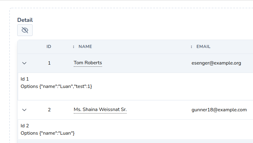
}Detail Row
In some cases we need to show more information in the table, for example: when selecting a product I would like to see which ingredients this product has or other information such as stock, billing, etc.
INFO
Note: The backend will only be queried when toggled.
Usage
To use the Detail Row you will need:
- Tailwind theme active
- Use the Detail class inside
setUp. - Have a blade view to show the details.
This is an example:
    use PowerComponents\LivewirePowerGrid\Detail;

    public function setUp(): array
    {
        return [
            // ..
            Detail::make()
                ->view('components.detail')
                ->options(['name' => 'Luan'])
                ->showCollapseIcon(),
        ];
    }
use PowerComponents\LivewirePowerGrid\Detail;
public function setUp(): array
{
return [
// ..
Detail::make()
->view('components.detail')
->options(['name' => 'Luan'])
->showCollapseIcon(),
];
}You can access your model data in the view file using the variable $row.
<!-- File: resources/views/components/detail.blade.php -->

<div class="p-2 bg-white border border-slate-200">
    <div>Id {{ $id }}</div>
    <div>Options @json($options)</div>

    @if ($row->calories < 100)
        <div>Diet dish!</div>
    @endif

</div>
<!-- File: resources/views/components/detail.blade.php -->
<div class="p-2 bg-white border border-slate-200">
<div>Id {{ $id }}</div>
<div>Options @json($options)</div>
@if ($row->calories < 100)
<div>Diet dish!</div>
@endif
</div>Result:
View
There are two ways you can specify the blade view with details:
- Passing the parameter
->view('components.detail') - Model data is available with the variable
$row. - Changing behavior in Action Rules
Parameters
In Detail, you can access any variable of the livewire powergrid component and pass other parameters together, for that do:
->options(['name' => 'Luan'])->options(['name' => 'Luan'])In the view, you can access the method like this (Example):
<div class="p-2 bg-white border border-slate-200">
    <div>Table: {{ $tableName }} </div>
    <div>Id: {{ $id }}</div>
    <div>Name: {{ $row->name }}</div>
    <div>Options: @json($options)</div>

    <div class="flex justify-end">
        <button wire:click.prevent="toggleDetail('{{ $id }}')" class="p-1 text-xs bg-red-600 text-white rounded-lg">Close</button>
    </div>
</div>
Collapse Others
- By default, powergrid will keep the open state of other details when you toggle a row using
toggleDetail. To close the last open use:
->collapseOthers()->collapseOthers()Toggle
You can toggle the detail via the toggleDetail method in Button::toggleDetail() or simply by calling the method $this->toggleDetail(string $id) passing the Id as a parameter.
Lazy
Lazy loading is a technique used in web development to optimize content loading, especially in situations where a large amount of data needs to be displayed on a page.
The goal is to initially load only essential data and fetch additional content as needed, typically triggered by user actions such as scrolling. This approach helps improve performance and reduces the initial load sent to the server.
The code snippet provided demonstrates the implementation of lazy loading. Let's explore the details of this implementation.
public function setUp(): array
{
    return [
       // ... other configurations
      Footer::make()
                ->showPerPage(100)
                ->showRecordCount(),

       Lazy::make()
          ->dispatchAfterToggleDetail('toggleDetailFromChild')
          ->rowsPerChildren(25),
    ];
}
public function setUp(): array
{
return [
// ... other configurations
Footer::make()
->showPerPage(100)
->showRecordCount(),
Lazy::make()
->dispatchAfterToggleDetail('toggleDetailFromChild')
->rowsPerChildren(25),
];
}Lazy Loading Configuration
Lazy::make(): This initiates creation of a lazy loading configuration.
dispatchAfterToggleDetail('toggleDetailFromChild'): Specify the event or action that triggers the additional content. In this case, when calling toggleDetail on the child component, toggleDetailFromChild will be sent to the parent containing two parameters: id and state.
#[On('toggleDetailFromChild')]
public function toggleDetailFromChild(string $id, string $state): void
{
    // $id: $row->id
    // $state: 'false' or 'true'
}#[On('toggleDetailFromChild')]
public function toggleDetailFromChild(string $id, string $state): void
{
// $id: $row->id
// $state: 'false' or 'true'
}rowsPerChildren(int $qty): Sets the initial number of items to load. In this example, only 25 lines will be loaded initially. Additional items will be loaded automatically as the user scrolls.
WARNING
This feature does not support using Livewire components inside (Ex: addColumns, actions ...)